GatherAI Brand Elevation
A frontier product wearing last year's clothes
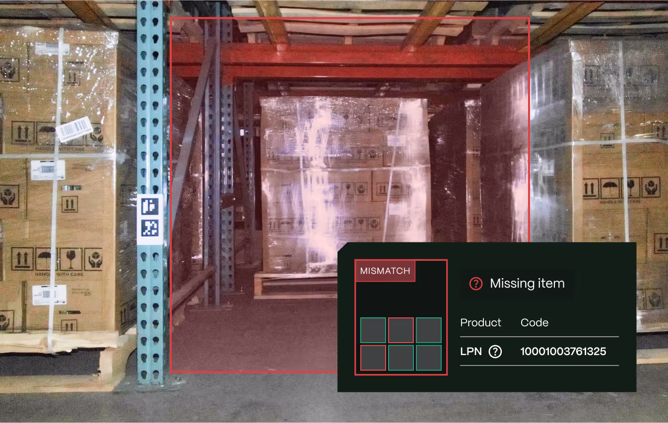
GatherAI builds drones that fly through warehouses, scanning shelves with onboard cameras and logging inventory back into the warehouse-management system. The hardware is off-the-shelf. What makes the product different is what the team calls a "curious" AI. Instead of scanning everything, it goes looking for specific things: barcodes, lot codes, expiration dates, damaged pallets, what's actually in each slot. It's built on classical Bayesian techniques combined with neural networks, which is why it doesn't hallucinate the way LLMs do.
When I joined in 2023, the technology was already ahead of the category. It later won a 2025 Nebius Robotics award and brought on real customers like Kwik Trip, Axon, GEODIS, and NFI Industries. But the brand hadn't caught up. Every customer-facing surface, from the website to the hardware on the warehouse floor, needed to communicate the same sophistication the product was already delivering.
The mandate was clear: elevate every brand expression and touchpoint so the company looked, felt, and operated like the category leader it was becoming.
Tell the story through the data
The brief had a point of view I agreed with immediately. Tell the story through the data, not pretty pictures. Show the pain each feature removes, and the intelligence each one delivers.
A frontier-tech brand earns trust by being specific, not decorative. Buyers in logistics don't fund vibes. They fund operational certainty. So the work couldn't just be beautiful. Every surface had to make the value legible: here is the pain, here is the feature that removes it, here is the data you get back.
That single principle, narrative through data, became the connective tissue across the website, the product UI, the event presence, and the hardware itself.
From feature-pitching to outcome storytelling
I led the effort and partnered closely with one designer based abroad, who brought the visual system to life across touchpoints. My job was to set the strategy, hold the craft bar, and give clear direction across timezones. Playbooks, review cadences, and a single source of truth so we could move fast without drifting.
The shift was simple but disciplined. Before, the story was "here's what our drones can do," a list of features shown in isolation. After, the story became "here's the warehouse problem, and here's the intelligence that solves it." Features tied to outcomes and the data they return.
That reframing became the basis for every brand artifact.
One system, every surface
From pixels to physical hardware, the elevated brand showed up everywhere a customer or investor might encounter GatherAI. Every artifact was handed off to the team as a reusable asset, not a one-off.
The website became the flagship expression of the new brand. Instead of hero shots and adjectives, each feature was framed around a real warehouse pain point and the specific data the platform returns. The redesign aligned the site with the funding narrative: a serious infrastructure layer, not a gadget.
The brand didn't stop at the screen. I extended the visual system onto the drones themselves and the drone carts used at conferences and marketing events. The physical product became a moving brand statement that read clearly from across a trade-show floor.
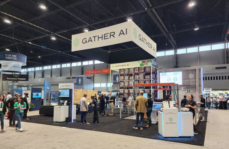
A coordinated kit carried the identity into attendees' hands. Apparel, stickers, one-pagers, leave-behinds. Everything was consistent with the website and product, so every touchpoint reinforced the same elevated story.
GatherAI Brand FigmaThe connective core was a cross-platform design system, consistent with the website and built for the product designers to work from. It accounted for the full surface area, including the iPad and iOS apps that drone operators use to maneuver and service their fleet on the warehouse floor.
In total, six touchpoint systems were unified under one identity: website, product UI, drone livery, event cart, swag, and the operator apps.

What this proves
Brand work, led well, is a fundraising instrument. Not decoration.
This project is the clearest example of how I lead brand and visual work. Start from the business moment (a raise), find the one principle that organizes everything (narrative through data), and extend it with discipline across every surface a customer touches, including the physical ones most teams forget.
It's also a record of leading a small, distributed team to a high craft bar across web, product, and hardware at once, and being honest about what could and couldn't be measured at the time. The brand did its job. It made a genuinely advanced company finally look the part. And the company went on to raise the round.
Outcomes
Here's the honest part. This work shipped in 2023 and 2024, during a period when the company didn't yet have analytics maturity in place. So I won't claim conversion lifts that weren't being tracked. And I won't claim a brand refresh "caused" a funding round years later. That's not how raises work.
The job wasn't to optimize a number. It was to build the brand that would help justify the next one.
What's true is this. The brand was built explicitly to make GatherAI look like the category leader it was becoming. In February 2026, the company closed a $40M Series B. The lead-investor relationship started exactly where this work was designed to perform: on the floor of a logistics conference, where the elevated brand showed up on screen, on the drones, on the cart, and in attendees' hands.
$40M
Series B led by Smith Point Capital. The company has raised $74M to date.
10×
Faster 0→1 delivery via the new framing and a shared system.
The new brand drew people to the booth. Customers kept telling us how impressed they were.
For a company telling investors it was the category leader, looking the part at the moment of truth was exactly the point.