AI Velocity & Multi Brand
Back to basics
Centerfield is a customer-acquisition company. My team owned design for partner brands including AT&T, Clover, Vivint, Business.com, Insurance.com, and Savings.com. The work was funnel and landing-page experiences running across millions of impressions a month.
I intentionally moved into a more hands-on role here after spending time in director-level leadership at Oracle. I joined as a Senior Manager because I wanted to get closer to the work itself while still shaping systems and team practices.
The core issue I walked into was that every funnel and landing page effectively started from a blank screen. The team didn't have a mature design system in place, so too much work was being recreated manually and too many decisions were being made inconsistently.
The bottleneck wasn't the team. It was the operating model around them.
Without a foundational design system practice:
- Brand style guidance existed, but it wasn't structured as a scalable system
- Variables, tokens, and component logic weren't being used to their potential
- Responsive design was being maintained as three separate device mockups rather than driven by auto-layout or shared components
- Routine content edits like a legal copy change or a logo update became multi-page manual work
So the opportunity was to create a design system that improved consistency, reduced manual effort, and laid the foundation for AI-enabled workflows.
Training & Modernizing
The work started with bringing semantic design system thinking into the organization.
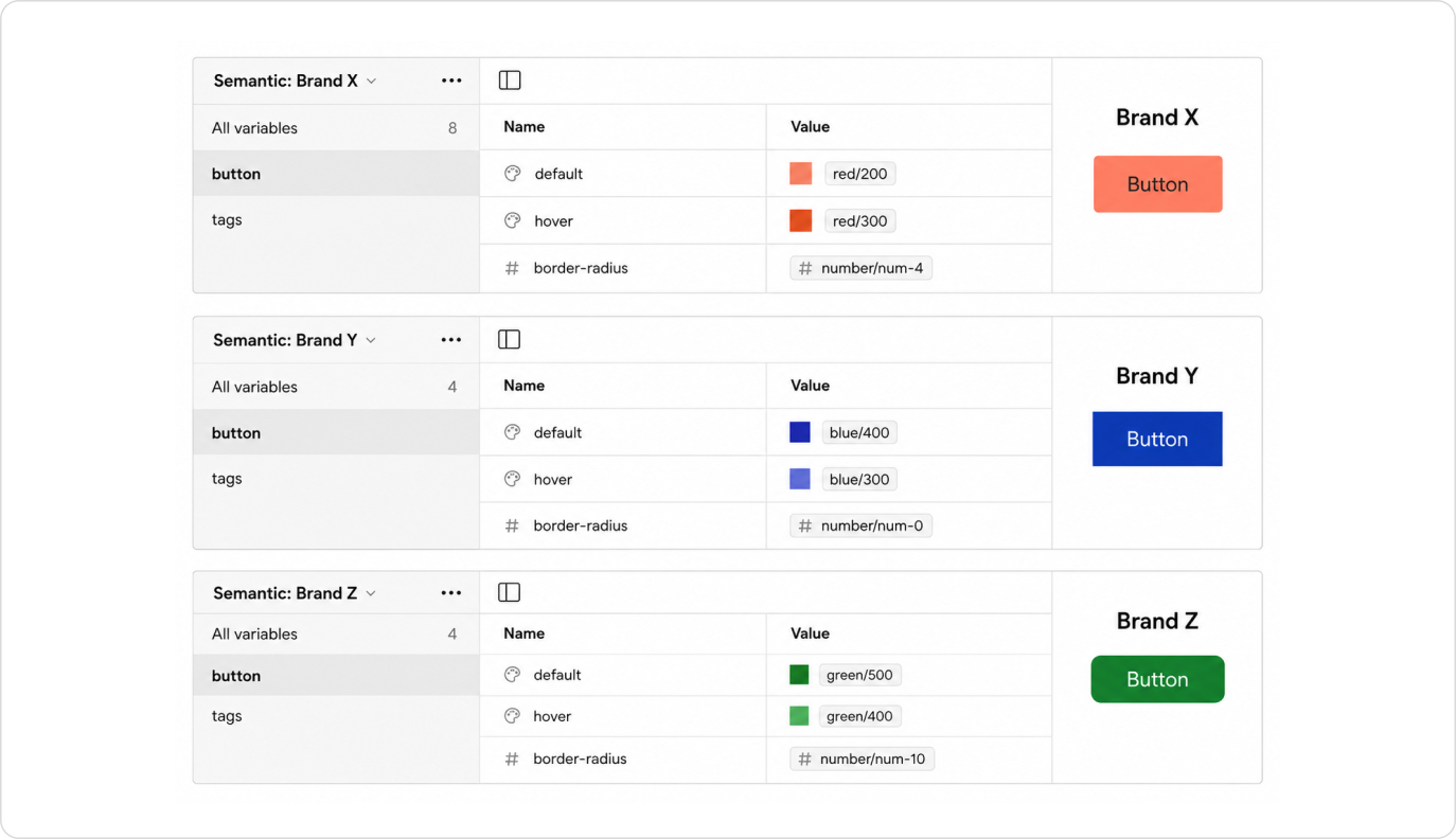
I helped train and usher in modern Figma practices like tokenized variables and auto-layout, mapping primitives to semantic intent-based variables, and a more structured component architecture for scaling repetitive work. Most excitingly, Figma had just launched multi-brand support through modes. With a single landing template, we could create a new brand mode to update the look and feel without duplicating the artboard.
The goal was to remove guesswork from execution. When spacing, color, or other decisions are defined at the token level, designers no longer spend time debating arbitrary values. The system creates consistency by default.
This also created stronger alignment between design and code, because the system language became more explicit and reusable.
2025 Team Training FigmaA key complexity in this environment was that the system had to support different brands, funnel types, and responsive behaviors across touch points. Handling desktop, mobile, and tablet responsive designs was where inconsistency had previously created the most confusion in layouts and grids.
This is where the multi-brand or multi-context value of a system becomes especially important: the system has to support variation without collapsing into chaos.
Mentorship
When I joined, the talent on my team was mixed. There were as many junior designers as senior. The juniors came from non-UX design backgrounds, so they hadn't yet been in environments that build UX practice and craft. Beyond the support I provided as their manager through 1-on-1s and day-to-day, I launched a mentorship program to pair the juniors with senior counterparts to shadow and learn. Each pairing had a final project where the junior focused on a specific area of growth: communicating effectively, UX research, visual design, or prototyping.
One pairing produced a clear measurable outcome. After a year of active mentorship, one of the junior designers was promoted to senior. She grew into leading brainstorming sessions with PMs, managing stakeholder feedback with poise, and managing her own timelines and deliverables. None of that was on her plate when she joined.
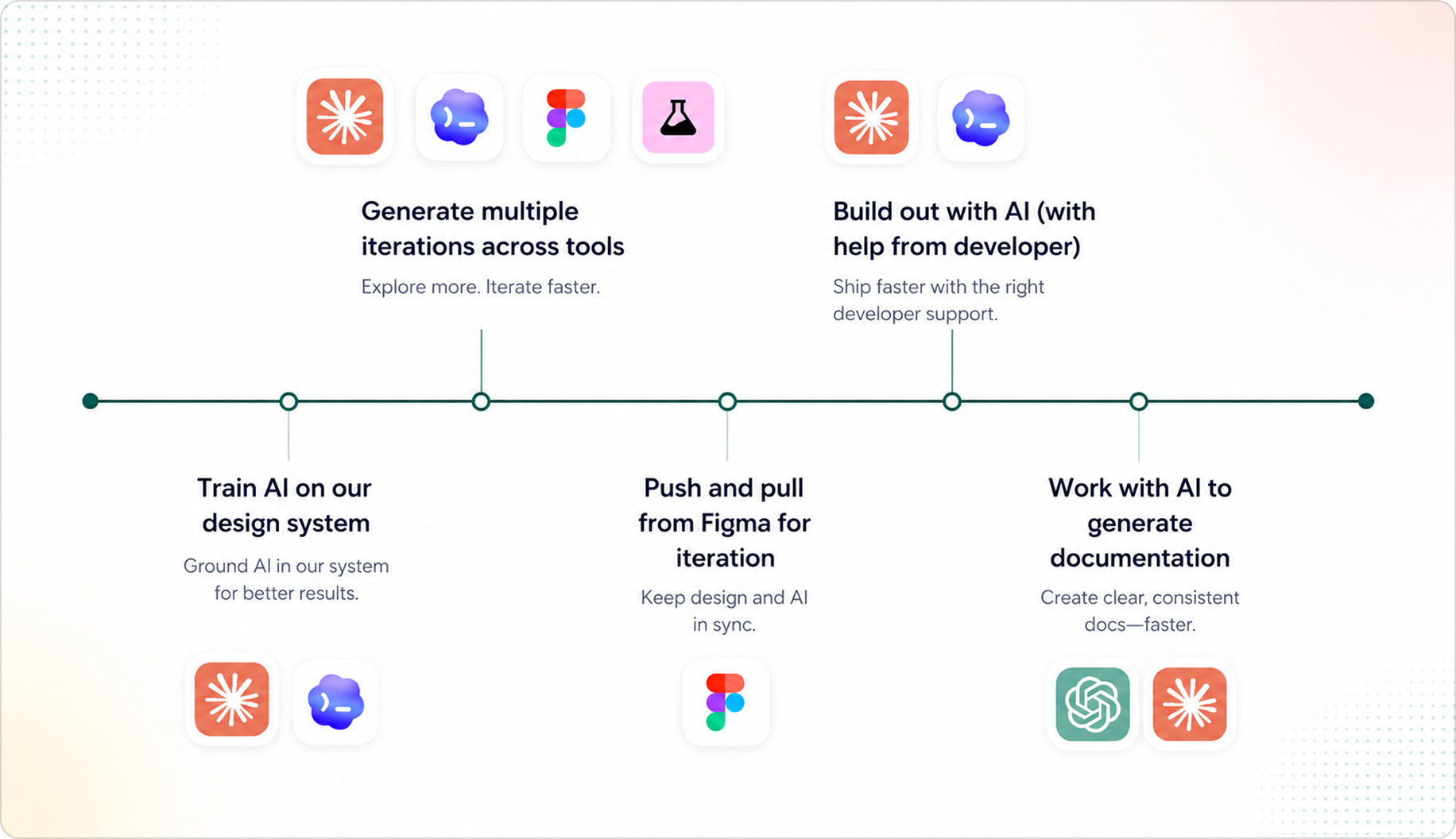
Accelerating with Claude, ShadCN, and Figma MCP
Another important evolution in this work was adopting ShadCN as a front-end layer to support componentization across cross-brand technical teams.
This mattered because the challenge was not only organizing design decisions in Figma. We also needed a practical implementation layer that could help teams unify effort across brands and experiences without rebuilding the same foundations repeatedly.
ShadCN gave us a strong front-end structure for that work. It created a shared component layer that supported consistency, accelerated execution, and still allowed enough flexibility for teams working in different brand or funnel contexts.
It also strengthened the AI tooling story. AI tools produce much higher-quality output when they're working from a structured component foundation rather than scattered or inconsistent patterns. So adopting ShadCN improved not just front-end reuse, but the reliability and quality of AI-assisted generation and prototyping.
A concrete example: when Clover rebranded.
Clover went through a rebrand, and they shared their refreshed brand guidelines with us. We took those guidelines and updated our design system inside Figma. From there, we used Claude Code to scan and update the entire Clover ecosystem of landing pages, applying the new brand across 20+ URLs in a fraction of the time a manual rebrand would have taken.
Outcomes
$3.5mm
Saved in annual design & dev resources for the business
35%
Faster design-to-delivery timelines via the new system
When we win, our customers win. Investing in AI is table stakes for our business.
By the time the system was running across all our partner brands, the cost of shipping a new landing page dropped in both dollars and time-to-market. Just as importantly, the team's energy moved away from rebuilding from scratch and toward judgment and craft. That's where designers belong in the first place.